
The naked truth?
17th February 2017
Actions speak louder than words
13th March 2017The naked truth?
17th February 2017Actions speak louder than words
13th March 2017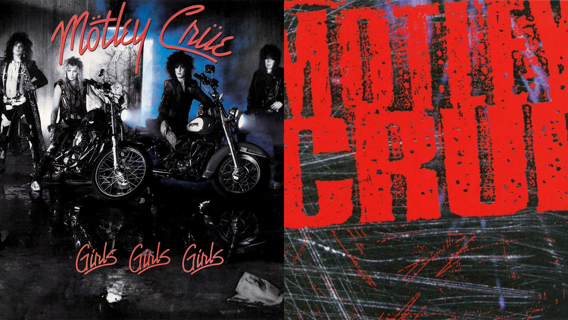
Through Grunge-colored glasses
With my forming years in late 80's and early 90's it's fun to see the impact Grunge movement had, not only on music, but also on the visual aspects of music, for instance the album covers. Oddly the album cover of the album that stated the revolution on a global scale didn't follow the rules it created.
It’s funny with trends and their impact. Often they start as some kind of statement or reaction, but as soon as they gain a certain level of commercial success they become a part of the business model.
When Grunge broke through worldwide, its approach to making music, image and nonetheless visual identity became something that record companies forced over most of existing rock bands, regarding of their legacy or path.
Looking at some of the album covers of the bands who made these adjustments (willingly or unwillingly) the shift if clear.
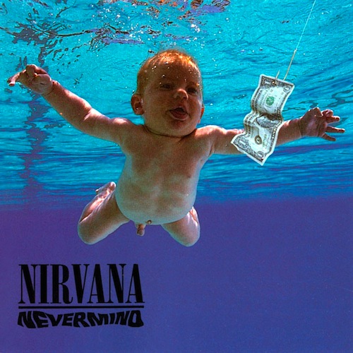
Nirvana are widely considered as godfathers of Grunge and while they most certainly didn’t start what became known as “Seattle movement”, they did make the it global. Absurdly, Nevermind, the album that broke Grunge to the worldwide stage is an album whose cover is nothing like those it inspired. Just look at the cover of that album. It’s not signalling Grunge in any way, with a possible exception of title, even thou it's written is the least Grunge font ever.
It's actually odd that someone has chosen this image for the cover of an album like Nevermind. Sure comparing to Nirvana's previous record Bleach, this album is far more polished in its sound, but it's still a rock album.
But, nevermind, the Grunge did change the landscape of rock music for few years and it's really fun observing those changes form the album cover point of view. Below are some examples of these changes from the existing bands.
Changes are sometimes drastic, other times less so, but they are always apparent. Common for all of them is that images, fonts and in some cases even logos drastically change in a direction of a messier, more abstract and unclean. The "ugly" and "messy" became pretty and nonetheless "IN". I guess the best word for describing this change is grungier.
Bellow you can see some examples and it's clear the changes that occur post 1991. The same goes for music itself as well as videos so do yourself a favor and check some of those out. Despite the radical change most of those changes did most certainly result in number of great (but often underrated) albums. Now that the hip of Grunge is couple of decades behind us you should give some of those albums a fair chance in case you didn't do that back in the day. Start with The Cult's The Cult, and follow it with Skid Row's Subhuman Race. Finish off with Anthrax's masterful Sound of White Noise, and then do yourself a favor and (re)discover some of the other many heavily underrated albums from the era.
MÖTLEY CRÜE:
A great example of the Grunge influence on a band's album covers comes from Los Angeles Glam rock legends Mötley Crüe. Back in 1997 the band released Girls, Girls, Girls, an album that embodied them greatly title and artwork wise. Their next release Dr. Feelgood saw them change their approach a bit inspired by the enormous global success of Guns N' Roses' Appetite For Destruction album. Its raw energy and simple image served as awake-up call for many big Glam bands who have been pushing the envelope with big hair and too much make up for too long. But the biggest change came on Mötley Crüe's first post Grunge album, the self-titled 1994 album.
-
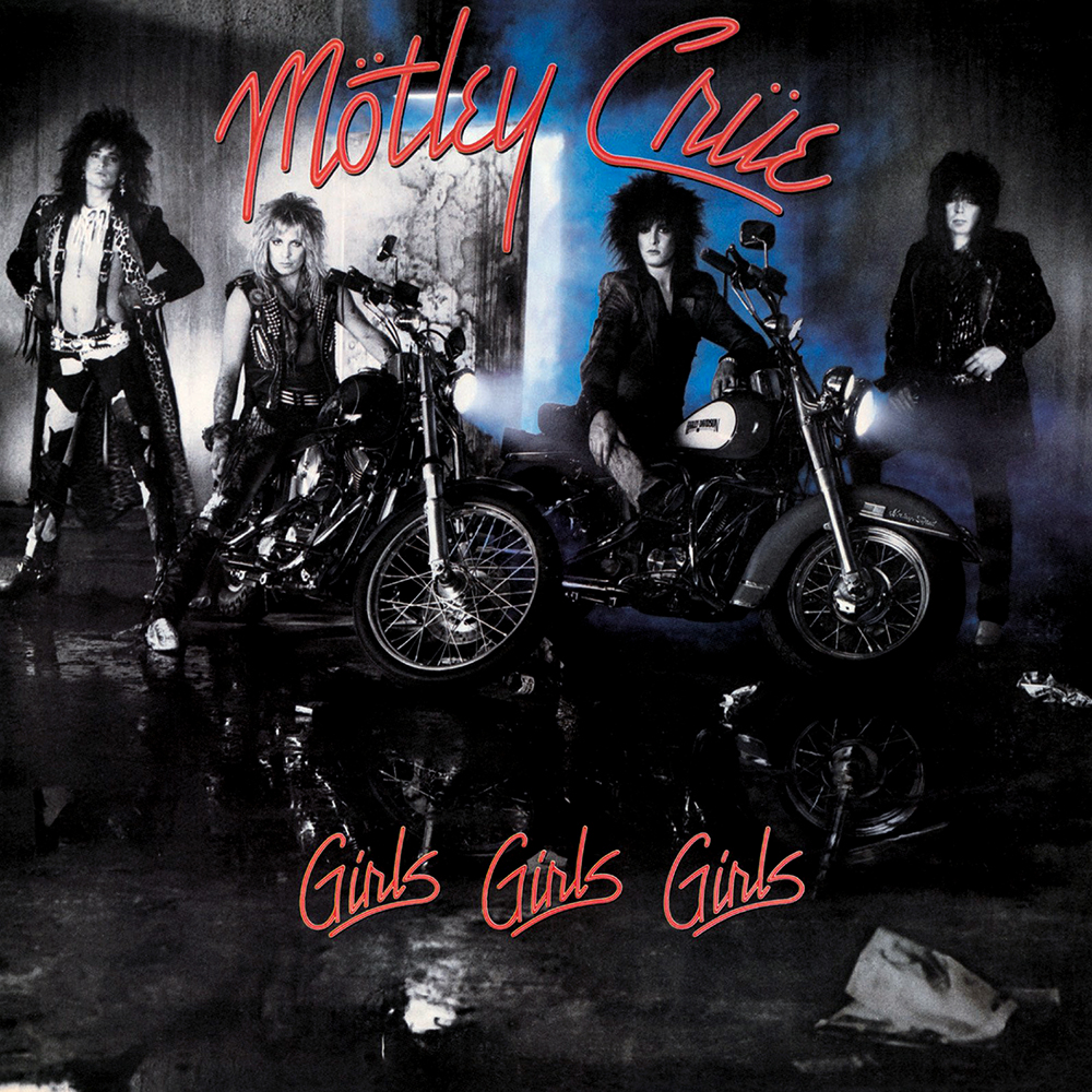
- 1987: Mötley Crüe – Girls, Girls, Gilrs
-
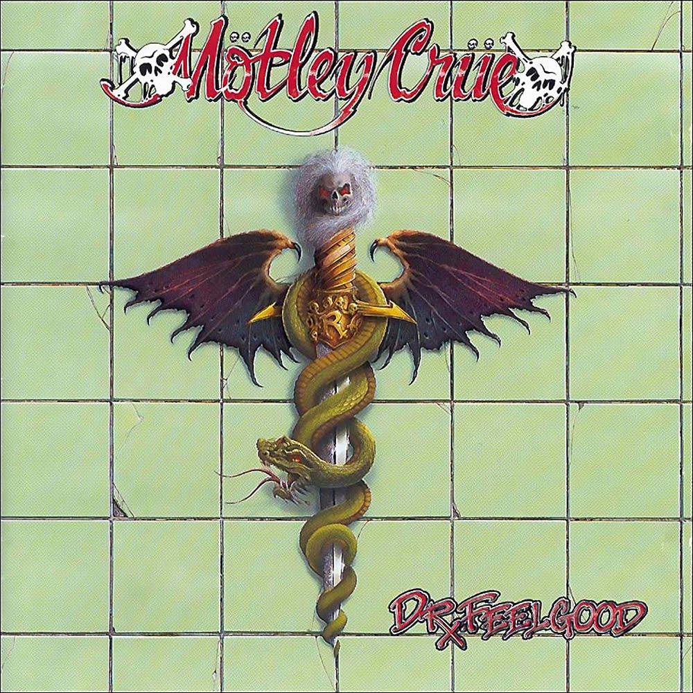
- 1989: Mötley Crüe – Dr. Feelgood
-
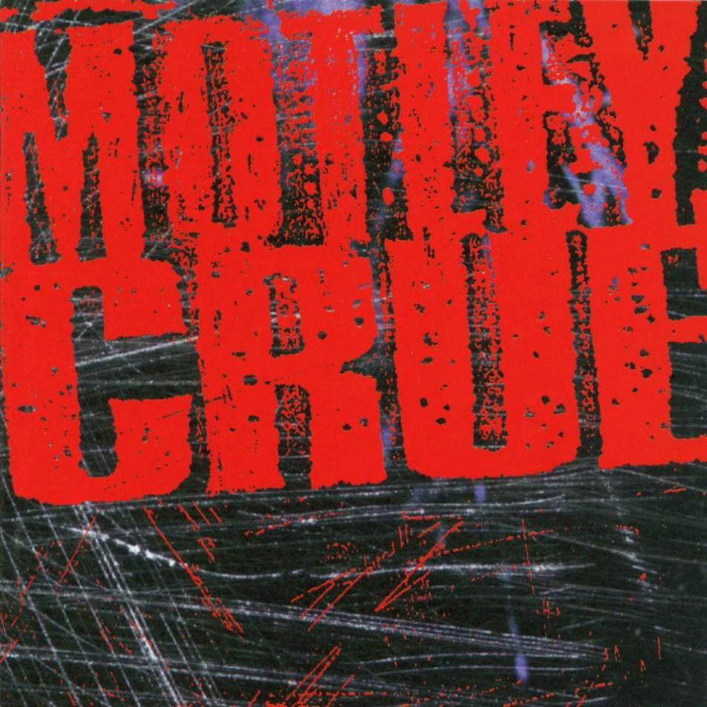
- 1994: Mötley Crüe – Mötley Crüe
WARRANT:
Warrant's 1990 release Cherry Pie was in many ways testament to state of Glam at given time. The cover, the tile, the song were all blow-up out of proportion and just way too cheesy. To be fair this album did include few very good songs whose focus was whole another place. After the success of Skid Row's Slave to the Grind album and the way it transformed the band into a band that could be taking more seriously, Warrant did the same with their 1992 Dog Eat Dog. By then however Gunge has already began to take over and this album was a commercial failure despite being the best release of their career. Fast forward few years ahead and Grunge is all over the place. Warrant were forced to move in same direction and the result is quite good Ultraphobic record. Comparing its artwork with Cherry Pie is as bizarre as it gets.
-

- 1990: Warrant – Cherry Pie
-

- 1992: Warrant – Dog Eat Dog
-

- 1995: Warrant – Ultraphobic
THE CULT:
With their 1989 release Sonic Temple, The Cult reached the commercial pinnacle of their career. The simple yet rocking artwork was ode to big rock album that it was. Couple of years later the band released Ceremony, which failed commercial, suffering from the Grunge-syndrome. With their next release they made a huge turn inspired by Grunge. It's without the doubt that record company pressured them into doing this, but in case of The Cult it also feels that the band was genuinely inspired by the change that came with Grunge. Result was one of the most underrated albums of the era. Cover-wise the shift was enormous. Just check out the logo on it.
-
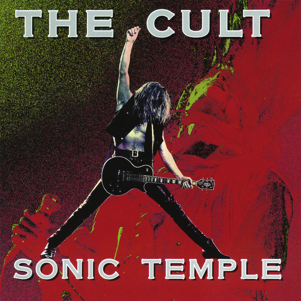
- 1989: The Cult – Sonic Temple
-
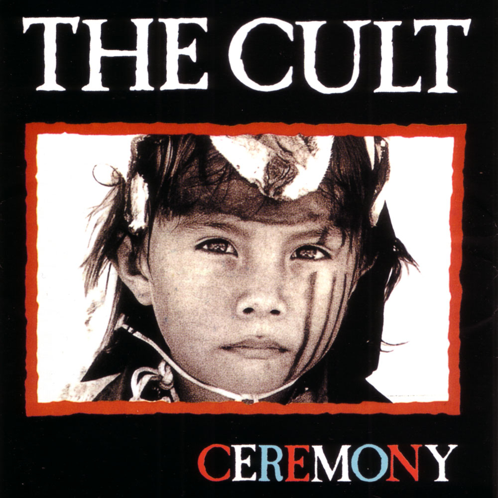
- 1991: The Cult – Ceremony
-
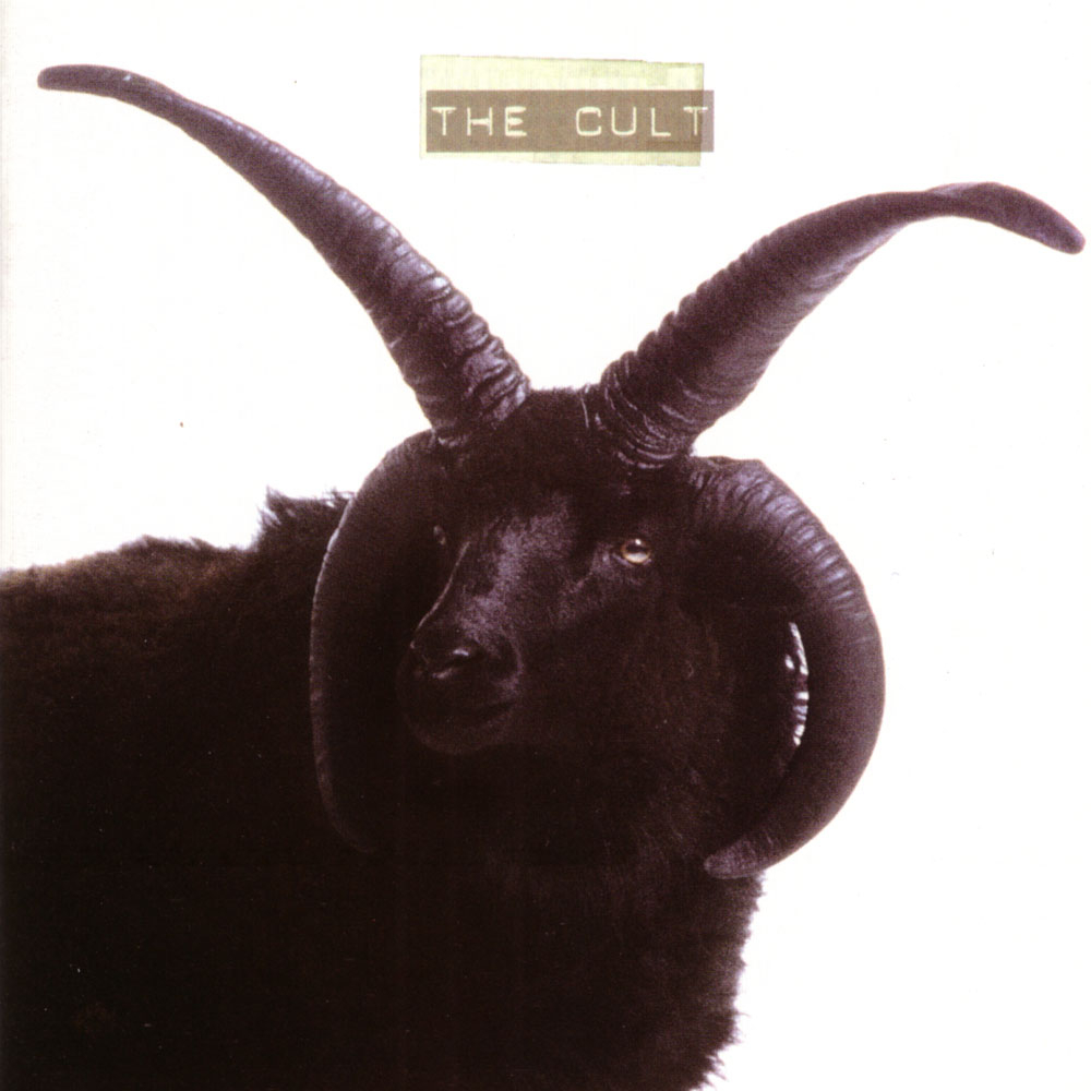
- 1994: The Cult – The Cult
ANTHRAX:
Who would've thought that metal-heads from Anthrax, too would get influenced by Grunge, and to such a degree. After releasing number of classic Thrash Metal records, packaged in appropriate matter, the band made a big shift with the release of their 1993 album, Sound of White Noise. The album marks their first release with new singer John Bush, but most importantly, music-wise the band was closer to Grunge than Thrash. To this day the album stands as one of their 3 best releases, but for many the shift was too much. Looking at these three album covers, Sound of White Noise stands out like a sore thumb.
-
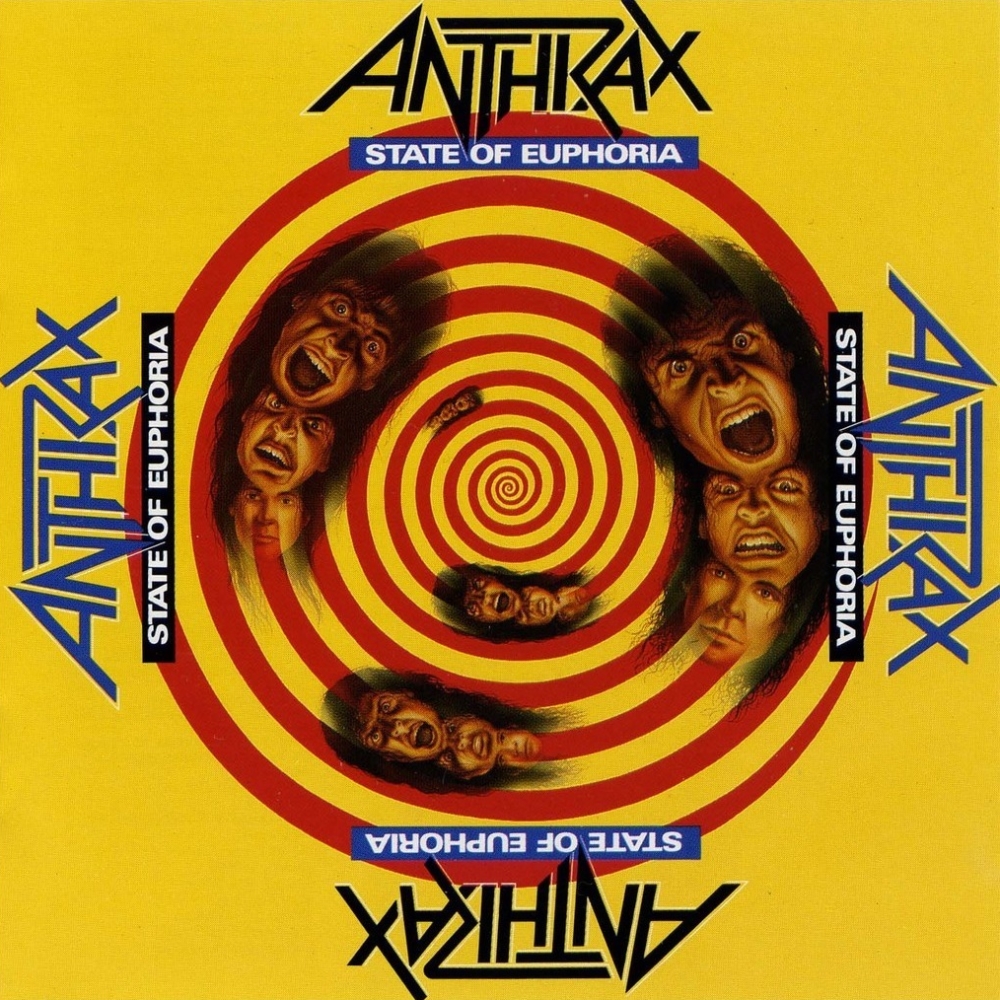
- 1988: Anthrax – State of Euphoria
-
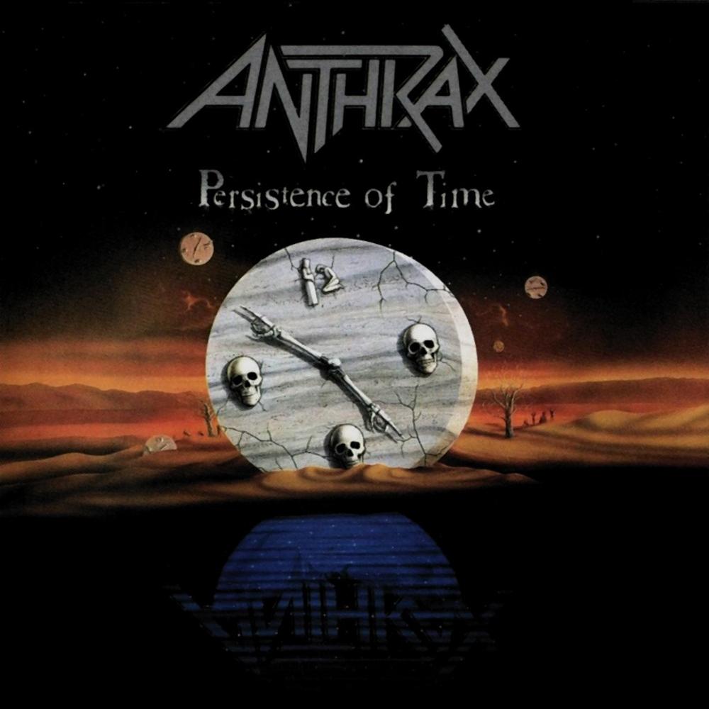
- 1990: Persistance of Time
-
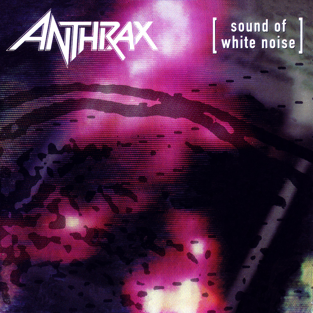
- 1993: Anthrax – Sound of White Noise
METALLICA:
Not even the biggest metal band in the world could pass the Grunge years without being affected by them. Their path, however, was bit different due to the massive change the band made when they released their self-titled album in 1991. Already then the band was making history by shifting from their Thrash Metal roots. Metallica are pioneers. They were so also when they released their first album back in 1983 and then again with the release of the 1991 album. The Grunge inspired change came when they released the follow up album Load.
-

- 1988: Metallica – …And Justice for All
-
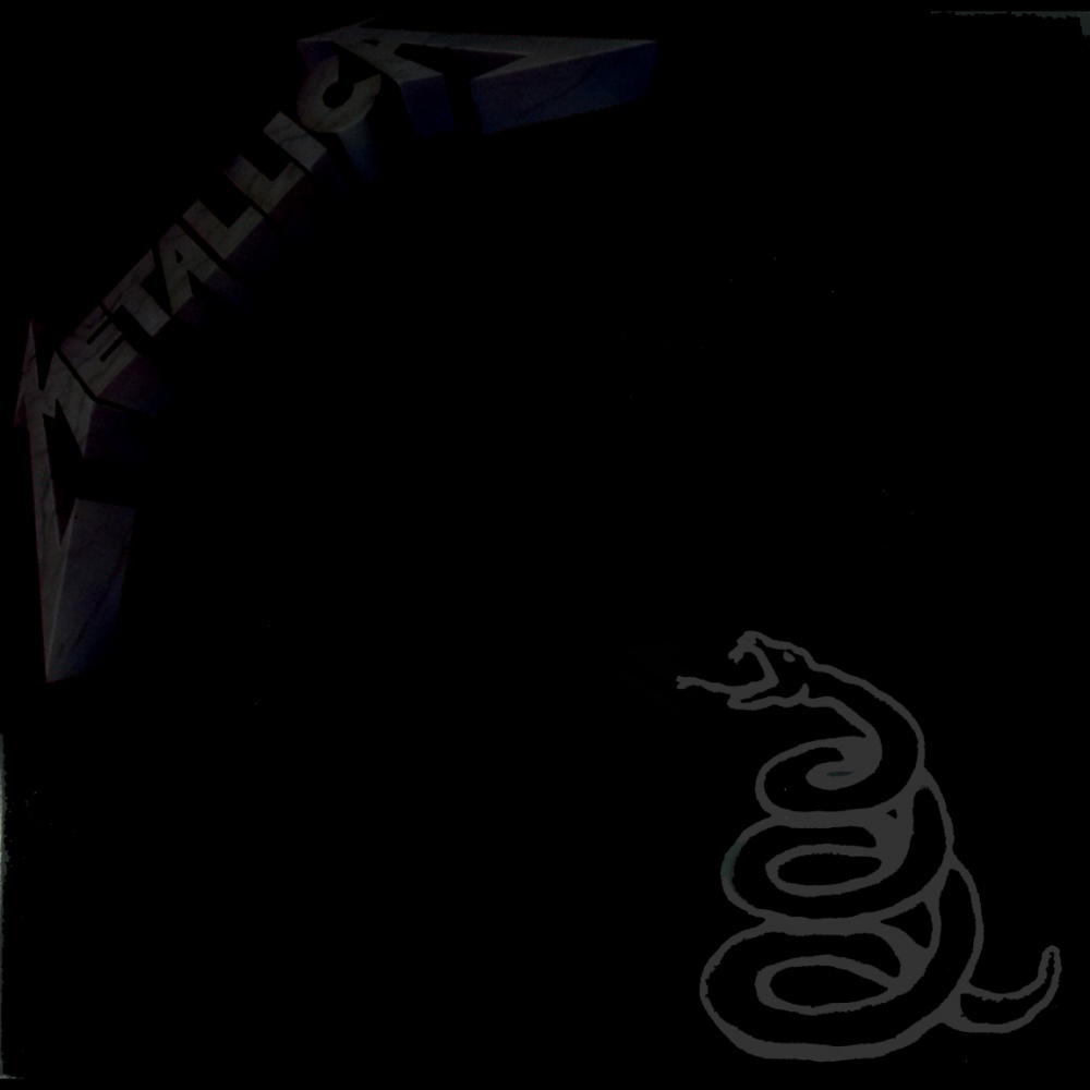
- 1991: Metallica – Metallica
-
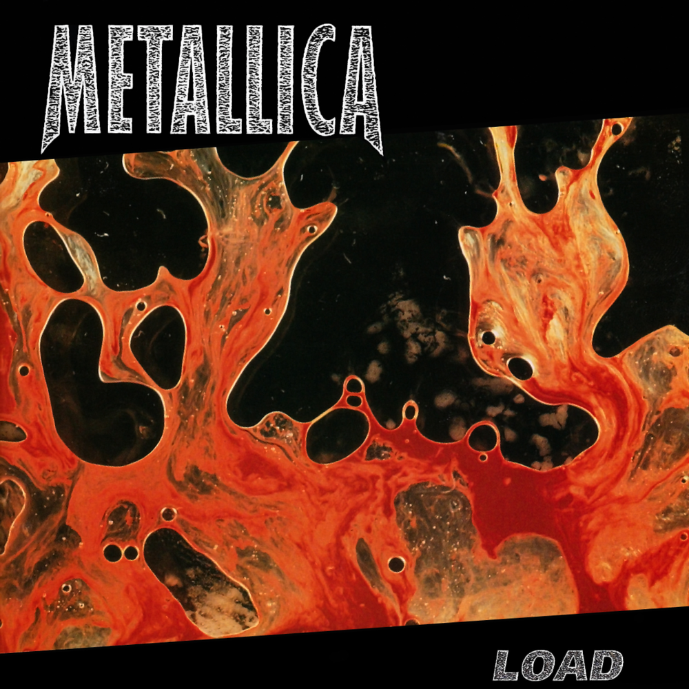
- 1996: Metallica – Load
SKID ROW:
Despite coming out and being part of the glam hard rock era of the late 80's Skid Row's debut was in no way a typical album cover for the era and neither was the cover for their 1991 sophomore album. But fast forward to 1995 and the world has been swept by grunge and NWOAHM, which also result in Skid Row adopting their music, image and album packaging. Subhuman Race is a perfect example of just that, even for the band whose previous couple of records didn't really follow the current trends of the time when they came out.
-
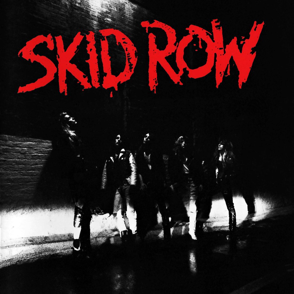
- 1989: Skid Row – Skid Row
-
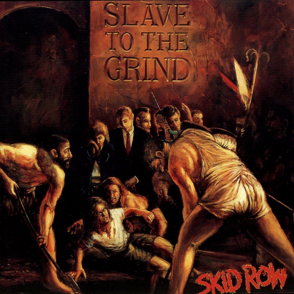
- 1991: Skid Row – Slave to the Grind
-
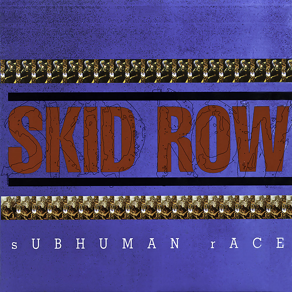
- 1995: Skid Row – Subhuman Race
IRON MAIDEN:
One of the most classic metal bands in history must be Iron Maiden and since the release of their very first album they have been very consistent about the covers for their albums. They were always colorful, cartoon-like and unrealistic. But then with the release of their first post-Grunge album, The X Factor, the band created a cover that is dark, realistic and while it's not outright Grunge it's most definitely inspired by it.
-
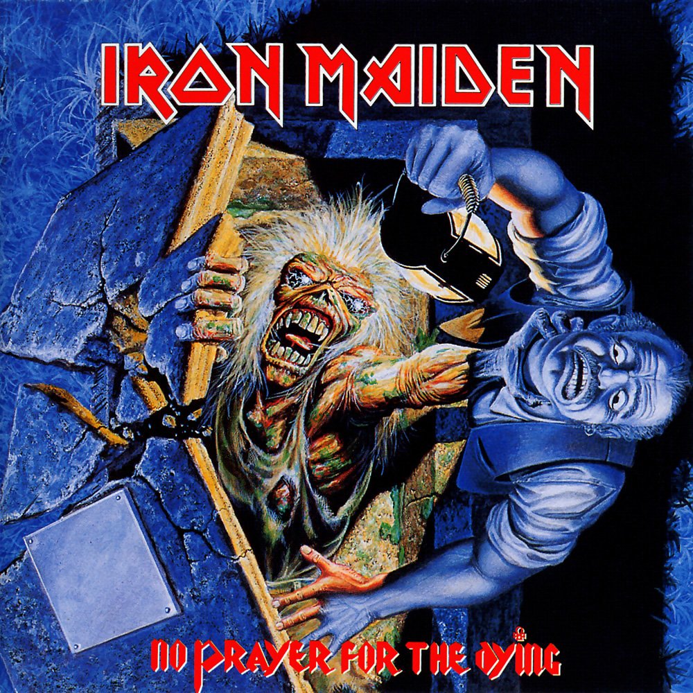
- 1990: Iron Maiden – No Prayer For the Dying
-
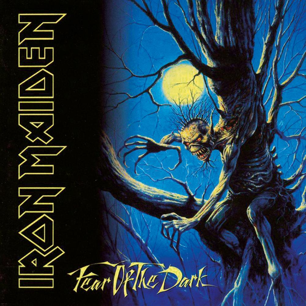
- 1992: Iron Maiden – Fear of the Dark
-
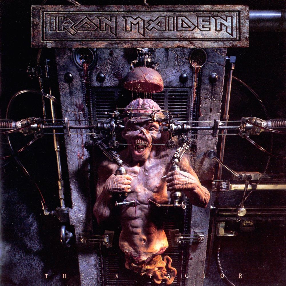
- 1995: Iron Maiden – The X Factor
I just gave Iron Maiden's The X Factor a spin and what an analysing and atmospheric album it is. Now I'm ready to give it few more spins and dig into the detail like I did countless times since it came out more then two decades ago. Now how can that not ... make me smile?